Tonjomar
Box Spring Cover Around Bed Box -Mattress Protector Encasement Wrap 4 Sides Elastic Bed Box Set for Twin/Full/Queen/King Bed 삿갓
Box Spring Cover Around Bed Box -Mattress Protector Encasement Wrap 4 Sides Elastic Bed Box Set for Twin/Full/Queen/King Bed 삿갓
Regular price
$75.62 USD
Regular price
$0.00 USD
Sale price
$75.62 USD
Unit price
per
Couldn't load pickup availability
SPECIFICATIONS
Brand Name: NoEnName_Null
CN: Hubei
Craft of Weaving: Knit
Fabric Count: 20
Feature 1: Queen quilt covers
Feature 2: Queen mattress cooling topper
Feature 3: Luxury comforter sets queen
Feature 4: Bed protection cover
Feature 5: Trampoline spring cover
Feature 6: Bed sheet cover
Feature 7: Bed covering
Feature 8: Box Spring bed covering
Hign-concerned Chemical: None
Main ingredients of fabric Percentage: POLYESTER
Material: 100% Polyester
Origin: Mainland China
Pattern: Plain Dyed
Pattern Type: Solid
Thread Count: 100TC
Use: Home,HOTEL
Weight: 300g
is_customized: No
Box Spring Cover Around Bed box -Mattress Protector Encasement Wrap 4 Sides Elastic Bed box set for Twin/Full/Queen/King Bed 삿갓
Package list:
1PC*Bed box cover
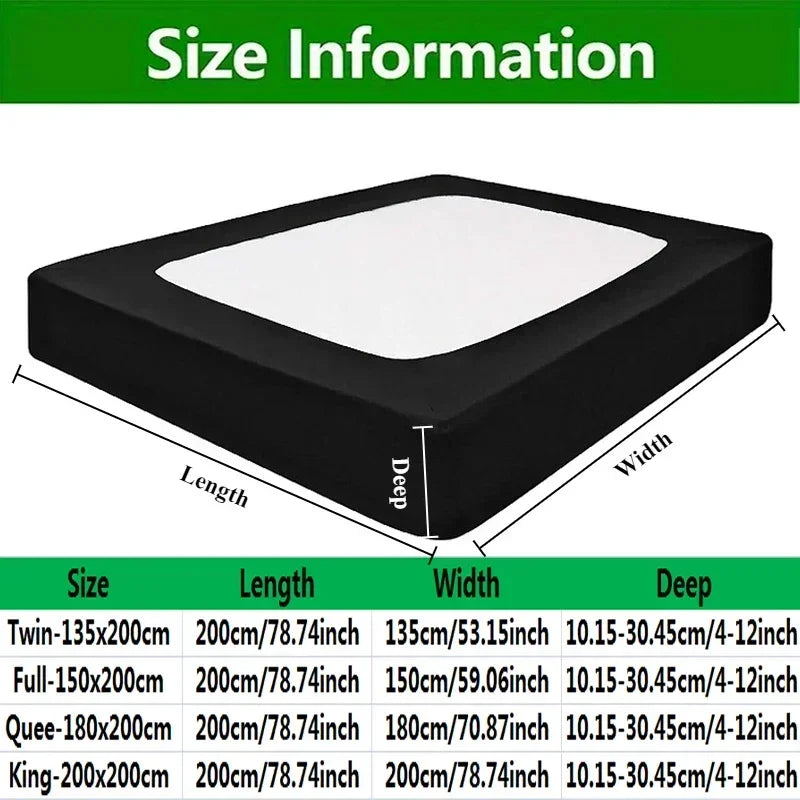
Size:
Twin:135x200cm/53.15x78.74inch
Full:150x200cm/59.06x78.74inch
Queen:180x200cm/70.87x78.74inch
King:200x200cm/78.74x78.74inch
Deep:10.15-30.45cm/4-12inch
Deep:10.15-30.45cm/4-12inch
Feature:
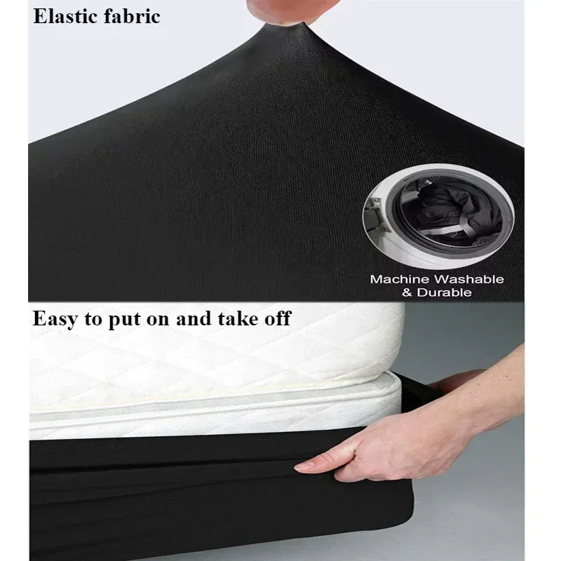
1.Sleek Design: Great alternative for traditional/wrap-around bed skirts, designed specifically for box springs, an ideal solution to hide ugly box springs and add a touch of elegance to any room.
2.Smart & Stretch-Fit: With a magic 4-way high stretch technology wrapping around your box spring, snug & clean look. NO care to prevent ripping elastic from fabric like wrap-around bed skirts.
3.Easy On/Off: Perfect fit for a standard box spring with polyester its fabric,for low profile ones.
4.Low Maintenance: NO needing to redo the bed skirt and straighten it up daily, decreases housekeeping work time, increases efficiency. Wrinkle free and machine washable
Note:
1.Please allow 1-3mm errors due to manual measurement.
2.Due to the difference between different monitors, the color may be slightly different from the pictures, pls take the real item as the standard.


.aplus-v2 .aplus-review-right-padding {
padding-right: 0.1rem;
}.aplus-v2 .aplus-review-right-padding {
padding-right: 0.1rem;
}.aplus-v2 .aplus-review-right-padding {
padding-right: 0.1rem;
}.aplus-v2 .aplus-review-right-padding {
padding-right: 0.1rem;
}.aplus-v2 .aplus-review-right-padding {
padding-right: 0.1rem;
}.aplus-v2 .aplus-review-right-padding {
padding-right: 0.1rem;
}.aplus-v2 .aplus-review-right-padding {
padding-right: 0.1rem;
}.aplus-v2 .apm-brand-story-carousel-container {
position: relative;
}
.aplus-v2 .apm-brand-story-carousel-hero-container,
.aplus-v2 .apm-brand-story-carousel-hero-container > div {
position: absolute;
width: 100%;
}/*
Ensuring the carousel takes only the space it needs.
The sizes need to be set again on the absolutely positioned elements so they can take up space.
*/
.aplus-v2 .apm-brand-story-carousel-container,
.aplus-v2 .apm-brand-story-carousel-hero-container {
height: 625px;
width: 100%;
max-width: 1464px;
margin-left: auto;
margin-right: auto;
overflow: hidden;
}
/*
This centers the carousel vertically on top of the hero image container and after the logo area (125px).
Margin-top = (heroHeight - cardHeight - logoAreaHeight) / 2 + logoAreaHeight
*/
.aplus-v2 .apm-brand-story-carousel .a-carousel-row-inner{
margin-top: 149px;
}
/*
Cards need to have a width set, otherwise they default to 50px or so.
All cards must have the same width. The carousel will resize itself so all cards take the width of the largest card.
The left margin is for leaving a space between each card.
*/
.aplus-v2 .apm-brand-story-carousel .a-carousel-card {
width: 362px;
margin-left: 30px !important;
}
/* styling the navigation buttons so they are taller, flush with the sides, and have a clean white background */
.aplus-v2 .apm-brand-story-carousel .a-carousel-col.a-carousel-left,
.aplus-v2 .apm-brand-story-carousel .a-carousel-col.a-carousel-right {
padding: 0px;
}
.aplus-v2 .apm-brand-story-carousel .a-carousel-col.a-carousel-left .a-button-image,
.aplus-v2 .apm-brand-story-carousel .a-carousel-col.a-carousel-right .a-button-image {
border: none;
margin: 0px;
}
.aplus-v2 .apm-brand-story-carousel .a-carousel-col.a-carousel-left .a-button-image .a-button-inner,
.aplus-v2 .apm-brand-story-carousel .a-carousel-col.a-carousel-right .a-button-image .a-button-inner {
background: #fff;
padding: 20px 6px;
}
.aplus-v2 .apm-brand-story-carousel .a-carousel-col.a-carousel-left .a-button-image .a-button-inner {
border-radius: 0px 4px 4px 0px;
}
.aplus-v2 .apm-brand-story-carousel .a-carousel-col.a-carousel-right .a-button-image .a-button-inner {
border-radius: 4px 0px 0px 4px;
}
padding-right: 0.1rem;
}.aplus-v2 .aplus-review-right-padding {
padding-right: 0.1rem;
}.aplus-v2 .aplus-review-right-padding {
padding-right: 0.1rem;
}.aplus-v2 .aplus-review-right-padding {
padding-right: 0.1rem;
}.aplus-v2 .aplus-review-right-padding {
padding-right: 0.1rem;
}.aplus-v2 .aplus-review-right-padding {
padding-right: 0.1rem;
}.aplus-v2 .aplus-review-right-padding {
padding-right: 0.1rem;
}.aplus-v2 .apm-brand-story-carousel-container {
position: relative;
}
.aplus-v2 .apm-brand-story-carousel-hero-container,
.aplus-v2 .apm-brand-story-carousel-hero-container > div {
position: absolute;
width: 100%;
}/*
Ensuring the carousel takes only the space it needs.
The sizes need to be set again on the absolutely positioned elements so they can take up space.
*/
.aplus-v2 .apm-brand-story-carousel-container,
.aplus-v2 .apm-brand-story-carousel-hero-container {
height: 625px;
width: 100%;
max-width: 1464px;
margin-left: auto;
margin-right: auto;
overflow: hidden;
}
/*
This centers the carousel vertically on top of the hero image container and after the logo area (125px).
Margin-top = (heroHeight - cardHeight - logoAreaHeight) / 2 + logoAreaHeight
*/
.aplus-v2 .apm-brand-story-carousel .a-carousel-row-inner{
margin-top: 149px;
}
/*
Cards need to have a width set, otherwise they default to 50px or so.
All cards must have the same width. The carousel will resize itself so all cards take the width of the largest card.
The left margin is for leaving a space between each card.
*/
.aplus-v2 .apm-brand-story-carousel .a-carousel-card {
width: 362px;
margin-left: 30px !important;
}
/* styling the navigation buttons so they are taller, flush with the sides, and have a clean white background */
.aplus-v2 .apm-brand-story-carousel .a-carousel-col.a-carousel-left,
.aplus-v2 .apm-brand-story-carousel .a-carousel-col.a-carousel-right {
padding: 0px;
}
.aplus-v2 .apm-brand-story-carousel .a-carousel-col.a-carousel-left .a-button-image,
.aplus-v2 .apm-brand-story-carousel .a-carousel-col.a-carousel-right .a-button-image {
border: none;
margin: 0px;
}
.aplus-v2 .apm-brand-story-carousel .a-carousel-col.a-carousel-left .a-button-image .a-button-inner,
.aplus-v2 .apm-brand-story-carousel .a-carousel-col.a-carousel-right .a-button-image .a-button-inner {
background: #fff;
padding: 20px 6px;
}
.aplus-v2 .apm-brand-story-carousel .a-carousel-col.a-carousel-left .a-button-image .a-button-inner {
border-radius: 0px 4px 4px 0px;
}
.aplus-v2 .apm-brand-story-carousel .a-carousel-col.a-carousel-right .a-button-image .a-button-inner {
border-radius: 4px 0px 0px 4px;
}